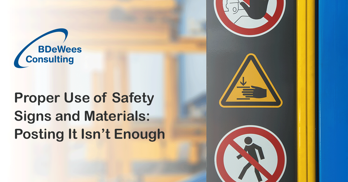
Proper Use of Safety Signs and Materials: Posting It Isn’t Enough
How to Properly Use Labels, Signs or Posters to Warn Employees of Potential Hazards.
Posters, signs, and labels hanging in hallways, pantries, and lunchrooms are the pièce de résistance of workplace safety campaigns. These tools emphasize the importance of office safety with interesting trivia or engaging images.
Putting safety materials on walls without much planning, however, can turn a useful tool into a waste of time and space. Posters and signs should be impactful, targeted, and well-planned to ensure their effectiveness.
Start with a Strategy
Safety material strategizing begins with knowing your audience. What are your workforce’s demographics? Will a serious or a humorous poster be effective? Employees have different opinions and not all safety messages will work on them.
Second, what’s the purpose of your materials? Are you trying to set a tone for current campaigns with a slogan? Should the message be specific or general? Safety materials with a purpose will surely impact your audiences.
Your strategy will determine the general theme of your safety posters and signs. Invest time in planning to create interesting materials.
Consider the Design
The Occupational Safety and Health Administration (OHSA) offers pre-made posters. But if you want to create your own, there are some considerations you shouldn’t ignore. The poster’s design is one.
The design is an important factor in the creation of safety materials. Posters, signs, and labels should be eye-catching but not overwhelming. When employees are preoccupied with deadlines, they will not stop to read walls of texts or stare at flashy images.
Safety material designs should be clear and simple. Instead of boring workers with too much information, create a design that is direct-to-the-point. Limit the text and include relevant visuals, such as photos, pictograms, and diagrams.
Proper Placement Matters
An attention-grabbing safety poster is useless if employees can’t see it. Location is, therefore, an important factor in your safety campaign, too.
Determine the right location by considering the safety materials’ messages. For example, place signs about putting gloves on before dealing with hazardous chemicals at locations where the danger exists. It would be strategic, moreover, to put up signs reminding employees of the importance of hand washing near the washroom’s sinks.
For posters that deal with general safety, high-traffic areas, such as hallways, restrooms, and pantries, are the best places to install them.
Refrain from also putting up posters in one place. Walls cluttered with too many signs are overwhelming; your audience is more likely to ignore the jumble of posters than to try to sift through all of it to find the message.
Create a Poster/Sign Cycle
Putting up dozens of data-filled posters and signs all at once and leaving them there for extended periods is not an effective strategy. Employees will most likely be overwhelmed with information and slowly forget or learn to tune them out.
A better solution is to rotate your poster scheduling, perhaps to coincide with safety topics of the month or quarter. Create posters that relate to seasonal workplace hazards or reflect relevant safety initiatives, such as Eye Injury Prevention Month or Fire Prevention Week.
New posters will catch your employees’ eyes, making them more likely to stop and read. If the new signs contain subject matter related to issues discussed recently, they can serve as reminders to reinforce workplace safety rules.
Feel free to bring these materials to safety meetings and use them as starting points for your discussion.
Only effective safety materials are capable of attracting attention and encouraging employee attention. These also complement your workplace safety campaigns against the backdrop of your company’s culture.
If you need assistance, do not hesitate to seek professional help. Call BDeWees Consulting today and see how we can enhance your workplace safety strategies.

